Documentation / Customizing Labels and Input Fields
Customizing Labels and Input Fields
Labels
The Labels panel controls the text that appears above each form field (e.g., “Username or Email Address”, “Password”).
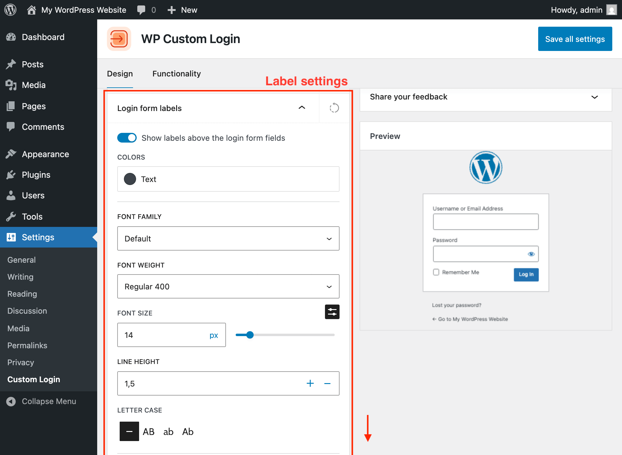
Accessing Label Settings
- Navigate to Settings → Custom Login.
- Open the Login form labels panel in the Design tab.
Visibility
Toggle the Show switch to hide form labels entirely. When labels are hidden, consider setting placeholder text on input fields so users still know what to type in each field.
Typography
- Font family — Choose from fonts available in your theme’s configuration.
- Font size — Set the label text size (default:
14px). - Font weight — Control the boldness of label text (100 to 900, with italic variants).
- Letter case — Transform label text to uppercase, lowercase, capitalize, or none.
- Line height — Set the spacing between lines (default:
1.5). - Text color — Choose the label text color.
Spacing
Adjust the margin and padding around each label using the individual top, right, bottom, and left fields.
Custom Label Text
Each label field supports per-language customization. If your site has multiple languages installed, you can set different label text for each language. The fields include:
- Username
- Password
- Username or Email Address
Input Fields
The Input Fields panel controls the appearance of text input fields on the login form.
Accessing Input Field Settings
Open the Login form input fields panel in the Design tab.
Colors and Borders
Input fields support three states with independent styling:
- Normal — The default appearance of the field.
- Hover — Appearance when the user hovers over the field.
- Focus — Appearance when the field is active and receiving input.
- Background color
- Text color
- Border width, style, color (each side independently)
- Box shadow
Input Typography
Configure the font family, font size, font weight, and line height for text entered in the input fields. The default font size is 24px.
Placeholder Text
Set custom placeholder text that appears inside empty input fields. Placeholder text supports per-language customization. Available placeholder fields include:
- Username
- Password
- Username or Email Address
Password Eye Icon
Customize the color of the password visibility toggle icon for normal, hover, and focus states.
Border Radius
Round the corners of input fields by adjusting the border radius for each corner independently.
FAQ
Find Answers to Common Questions
Browse these frequently asked questions to get quick answers about our plugin, features, and support.
Will This Plugin Work on My WordPress Website?
This plugin does not depend on any third-party libraries, plugins, or themes. It will work seamlessly on any WordPress website.
Does the Plugin Support My Language?
This plugin is translation-ready, enabling you to easily translate its content into your preferred language using any translation tool or plugin. By default, the plugin is provided in English.
What Are the Technical Requirements for This Plugin?
This plugin requires WordPress version 6.6 or later and PHP version 7.4 or later. It doesn’t require additional libraries or special hosting configurations.
The plugin has been tested up to WordPress 6.9 and PHP 8.3.
What Is Your Refund Policy?
We offer a risk-free, 30-day money-back guarantee. If you’re not satisfied with the plugin for any reason, you can request a full refund within 30 days of your purchase – no questions asked.
Is This Plugin Actively Maintained?
Yes! This plugin is actively maintained and regularly tested for compatibility with the latest versions of WordPress and PHP. For detailed information about updates, please refer to the changelog.
What Happens If I Don’t Renew My License?
You can continue to use the plugin even if your license expires; however, you will no longer receive plugin updates, new features, or access to support. Your license renews automatically each year unless canceled via the Customer Portal.
What Is the Difference Between the Free and PRO Versions?
The free version gives you full control over the login page’s visual design — custom logo, background color and image, form container styling, label and input field customization, primary and secondary button design, checkbox styling, notice and error message colors, under-form link styling, social media icons, custom footer, privacy policy link, language switcher controls, per-language text, and a custom CSS editor. You also get functionality options like disabling autofocus, the error shake animation, and browser autocomplete. Everything is configured from a visual settings page with a live preview.
The PRO version adds 20+ pre-designed templates you can apply in one click, advanced background options (multi-column split-screen layouts, image and video sliders, animated gradients, CSS image filters and color overlays), post-login redirect rules with per-role and per-user targeting, the ability to replace wp-login.php with a custom login URL, and priority support with automatic updates. See the pricing page for details.